Have you ever painted a room only to feel like something was just… off? You followed your instincts, picked a color you loved on the swatch, and yet the finished result left you disappointed. You’re not alone. Choosing the perfect color combination for your home interior is one of the most exciting — and most misunderstood — parts of decorating.
Color is powerful. It shapes how a room feels, how big it looks, and how much you enjoy spending time in it. The right palette can turn a plain bedroom into a cozy retreat or transform a cramped living room into an airy, welcoming space.
The good news? You don’t need to be an interior designer to get it right. With the right approach and a few proven techniques, anyone can create a beautiful, harmonious home. Let’s walk through everything you need to know.
Why Color Combinations Matter More Than Individual Colors
Most people focus on finding their favorite color and painting the walls in that shade. But that’s only half the equation.
A color that looks gorgeous in isolation can feel completely wrong when it’s surrounded by furniture, lighting, and flooring. What makes a room truly beautiful isn’t one perfect color — it’s how colors interact with each other.
Think of it like a great outfit. A bold red jacket might look amazing when paired with neutral grey trousers, but overwhelming when worn with bright printed pants. Your home works the same way. The goal is balance, contrast, and harmony.
That’s why understanding color combinations for your home interior is the real key to decorating success.
Start with the Color Wheel — Your Most Useful Design Tool
Before you browse paint swatches or scroll through Pinterest boards, take five minutes to understand the color wheel. It’s the foundation of every great interior design decision.
Here are the three main color relationship types you need to know:
- Complementary Colors — Colors that sit directly opposite each other on the wheel, like blue and orange, or purple and yellow. These create bold, high-contrast looks full of energy and visual interest.
- Analogous Colors — Colors that sit next to each other, such as green, blue-green, and teal. They feel naturally harmonious and calm, making them ideal for relaxed living spaces and bedrooms.
- Triadic Colors — Three colors spaced evenly around the wheel, like red, blue, and yellow. This combination feels playful and vibrant when used with care.
Start by identifying which type of relationship appeals to you. That single choice will instantly narrow down your palette and give you a clear direction.
Use the 60-30-10 Rule for a Professionally Balanced Room
This is one of the most popular rules in interior design, and for good reason — it works every single time.
The idea is simple: divide your room’s color into three proportions.
- 60% Dominant Color: This is your main backdrop — walls, large rugs, or a big sectional sofa. Choose something neutral or muted that can anchor the space without overwhelming it.
- 30% Secondary Color: This complements the dominant shade and appears in curtains, a feature wall, an armchair, or a large area rug. It adds depth without competing for attention.
- 10% Accent Color: The boldest element in the room. Use it in throw pillows, artwork, plants, lamps, or decorative accessories. This small pop of color is what gives the room personality.
For example, imagine a living room with warm white walls (60%), a dusty sage green sofa and curtains (30%), and terracotta accents in the cushions and a ceramic vase (10%). That combination is grounded, modern, and instantly inviting.
How to Choose a Color Combination Based on Room Mood
Every room in your home has a job to do. Your bedroom needs to help you relax. Your kitchen should feel fresh and energizing. Your home office should help you concentrate. The color combination you choose should match the purpose of the room.
Here’s a room-by-room breakdown to guide you:
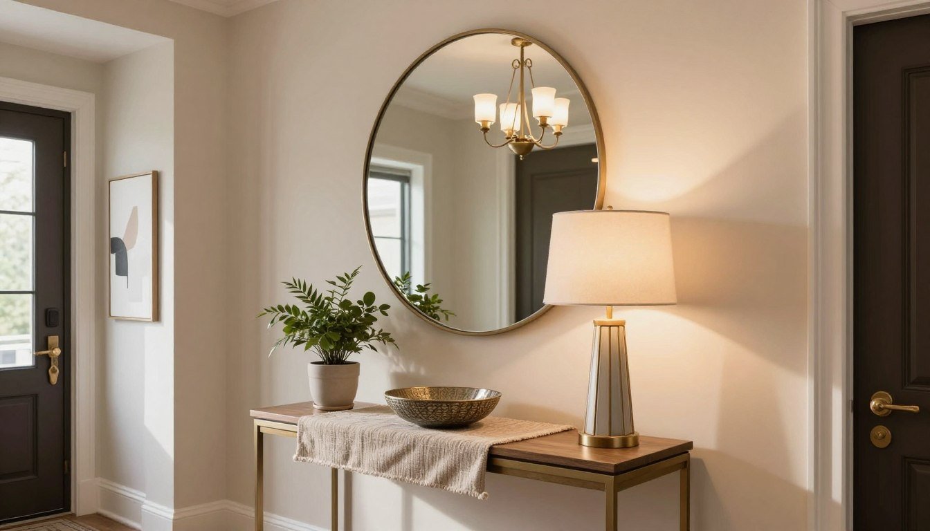
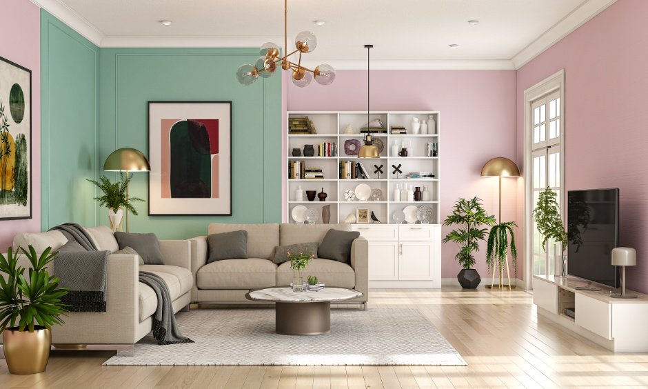
Living Room: Warm neutrals, dusty tones, and earthy palettes work beautifully. Think beige, warm taupe, terracotta, and muted greens. These tones feel welcoming and make guests instantly comfortable.
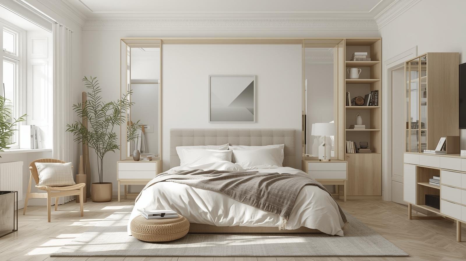
Bedroom: Soft, cool, and muted tones are your best friends here. Pale blue, lavender, sage green, and warm white promote rest and calm. Avoid overly bright or stimulating colors in spaces where you need to sleep.
Kitchen and Dining Area: This is where you can get a little bolder. Warm yellows, soft reds, fresh greens, and crisp whites bring energy and appetite. A classic white kitchen with forest green lower cabinets is one of the hottest trends right now.
Bathroom: Spa-inspired palettes of white, soft grey, pale blue, and stone tones create that clean, refreshing feel. Add natural textures like wood or rattan to bring warmth.
Home Office: Deep, rich tones like navy, charcoal, forest green, or burgundy promote focus and productivity. Balance them with lighter walls or plenty of natural light.
Trending Color Combinations for Home Interiors in 2025
If you want your home to feel fresh and current, these are the palettes making waves right now.
- Warm Earth Tones: Terracotta, rust, warm beige, and sand are everywhere right now. This palette feels grounded, natural, and deeply cozy. Pair it with raw wood furniture and linen textiles for a beautiful boho-meets-organic look.
- Sage Green and Creamy White. This combination is having a major moment. Sage green is soft, soothing, and incredibly versatile. It works in kitchens, living rooms, and bedrooms. Pair it with off-white or warm cream for a dreamy, effortless aesthetic.
- Navy Blue and Brass. For a more dramatic, sophisticated feel, navy walls or furniture paired with brass hardware and warm lighting creates a luxurious, timeless look. Add cream or ivory to soften the contrast.
- Warm Blush and Mocha Soft pink tones paired with deeper brown or mocha shades create a romantic, modern feel. This palette works especially well in bedrooms and reading nooks.
- Olive Green and Off-White: A slightly deeper, more muted take on the green trend. Olive feels earthy and rich, and when paired with off-white walls and natural wood, it creates a relaxed, effortlessly stylish space.
Common Color Mistakes to Avoid in Home Interiors
Even with the best intentions, it’s easy to make color mistakes that throw off the whole room. Here are the most common ones and how to avoid them.
- Choosing paint color before buying furniture: Always finalize your big furniture pieces first. Your sofa, rug, or flooring should guide your wall color — not the other way around.
- Ignoring your lighting: Natural and artificial light completely change how a color looks. Always test paint samples in your actual room at different times of day before committing.
- Going too matchy-matchy: Choosing everything in the same shade makes a room feel flat and boring. Variety in tone, texture, and depth is what gives a space life.
- Forgetting the ceiling and trim: The ceiling is often called the fifth wall. A soft, warm white on the ceiling and crisp, bright white on the trim can completely elevate your room’s color combination.
- Using too many accent colors: Stick to one or two accent colors to avoid visual chaos. More is not always more when it comes to color.
Practical Tips for Testing Your Color Combination Before Committing
Once you have a palette in mind, don’t rush straight to redecorating. Take the time to test it properly.
Here are a few smart ways to do that:
- Buy paint sample pots and paint large swatches (at least 30cm x 30cm) on your actual walls. Live with them for several days before deciding.
- Use a mood board — physical or digital. Collect paint chips, fabric swatches, magazine clippings, and material samples. Seeing everything together is far more reliable than imagining it.
- Try a free online room visualizer tool. Many paint brands like Dulux and Benjamin Moore offer apps where you can upload a photo of your room and virtually apply colors.
- Look at your existing pieces. Your flooring, existing furniture, and fixed architectural features like brick or stonework should influence your palette. Work with what you already have.
Patience here pays off enormously. Taking an extra week to test before committing can save you months of living with a color you don’t love.
How to Add Color Without Repainting
Not ready for a full repaint? That’s perfectly fine. You can completely transform the feel of your home interior with color accents that don’t require a single drop of paint.
- Swap out your cushion covers and throws in a new seasonal palette.
- Add a large statement rug in a bold or complementary color.
- Hang a gallery wall with art that brings in your desired color tones.
- Introduce colorful curtains or blinds for an instant room refresh.
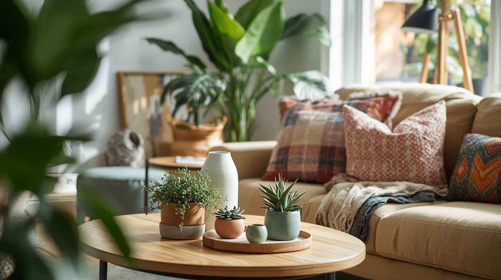
- Bring in plants — greenery adds freshness and works with almost any color scheme.
- Use colored furniture, like a statement armchair or painted bookshelf, as a focal point.
These small, low-commitment changes can have a surprisingly big impact on your home’s color story.
Conclusion — It’s Time to Transform Your Home with the Right Colors
Choosing the perfect color combination for your home interior doesn’t have to be stressful. When you understand the basics — the color wheel, the 60-30-10 rule, the psychology of color, and how light affects your choices — you have everything you need to make confident, beautiful decisions.
Your home is your sanctuary. It should reflect who you are, lift your mood, and make every day feel a little better. The right colors can do exactly that.
Don’t wait for the “perfect” moment to start. Pick one room, try one new palette, and see how transformative the right color combination can be. You might just fall in love with your home all over again.
Frequently Asked Questions (FAQs)
1. What is the best color combination for a home interior? There’s no single “best” combination — it depends on your personal style and the room’s purpose. However, timeless pairings like warm white with sage green, navy with brass accents, or earthy neutrals with terracotta are universally loved and easy to work with.
2. How do I choose colors for an open-plan living space? In open-plan spaces, use a consistent base color throughout to maintain flow, then shift your accent and secondary tones to define different zones. Analogous color palettes work especially well here because the transitions between areas feel natural and harmonious.
3. Can I use dark colors in a small room? Absolutely. Contrary to popular belief, dark colors can actually make a small room feel more intimate and cozy rather than smaller. The key is to balance dark walls with light furniture, good lighting, and mirrors to maintain a sense of brightness.
4. How many colors should I use in one room? A good rule of thumb is to stick to three colors per room — a dominant tone, a secondary shade, and one accent color. Using more than three can quickly feel busy and overwhelming, unless you’re confident in creating a maximalist look intentionally.
5. What are the most popular interior color trends for 2025? The biggest color trends for 2025 include warm earth tones like terracotta and rust, sage green paired with creamy white, olive green with natural wood, moody navy with brass, and warm blush with mocha. These palettes reflect a broader trend toward natural, grounding, and nature-inspired interiors.
Leave a Reply